 Living
Define success before the world does it for you.
By Sara Tilla
A bed is one of the largest visual surfaces in a bedroom, yet bedding is often chosen as if it were a small practical afterthought.
 WORDS BYAndrea HillsOctober 21, 2026
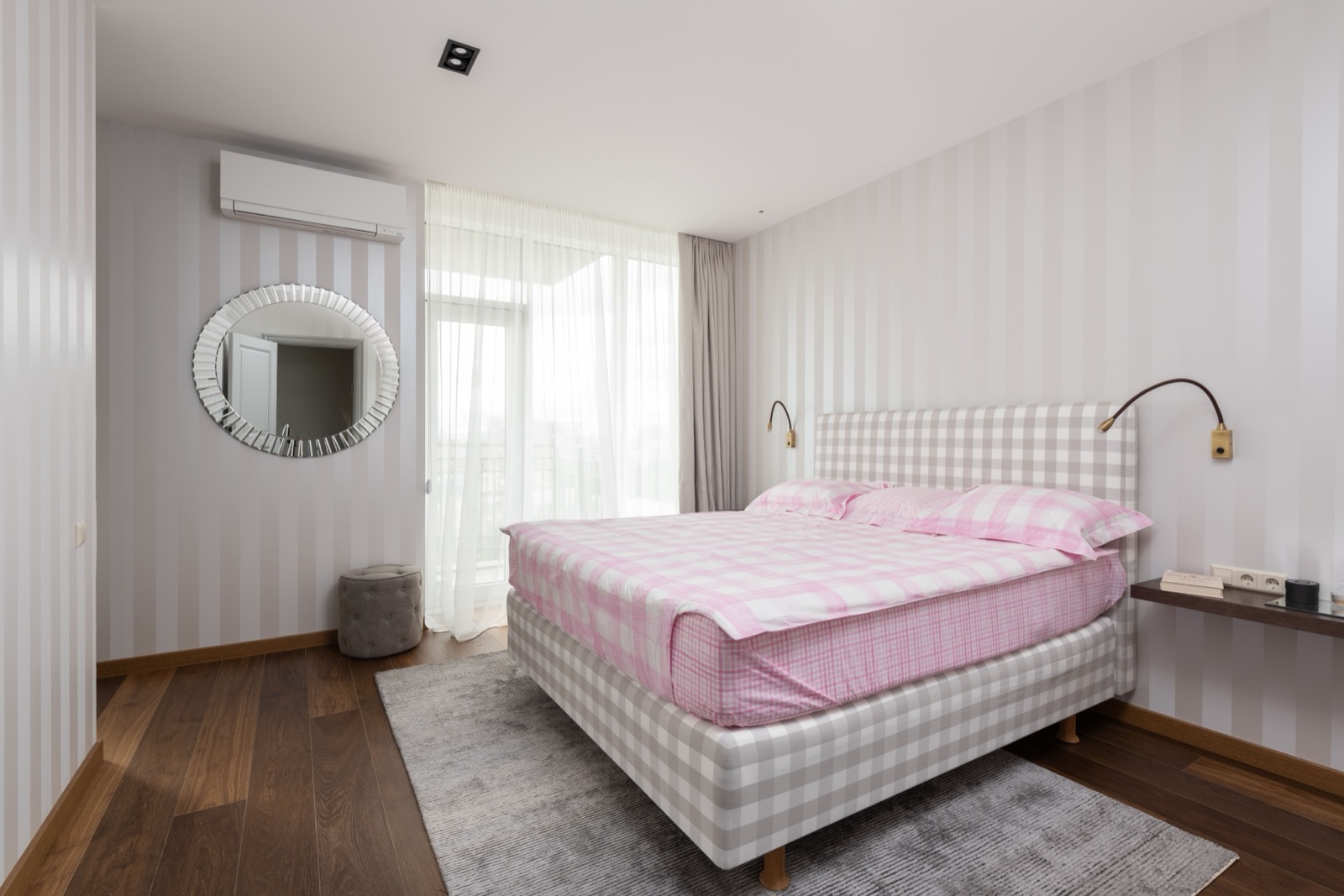
A bed is one of the largest visual surfaces in a bedroom, yet bedding is often chosen as if it were a small practical afterthought. The result can be a room whose furniture has been considered carefully while its central textile composition remains accidental. Looking at the bed through the language of clothing changes the questions. How does the fabric fall? Where should an edge sit? What proportion of colour is visible? Which details are decorative, and which make the object easier to use?
Millaux provides a current example of this way of thinking. On its own site, the brand describes custom-made bedding and a couture-like approach to textile design, and its size guide offers bespoke dimensions. That is the brand's positioning, not a claim of formal haute couture status or an independent endorsement of its quality. The interesting broader idea is that a bed can be treated as a composition of material, proportion and finish, much as an outfit can.
A bed's appearance is shaped by the relationship between its visible parts: mattress height, frame, headboard, duvet, pillows and any additional cover. A generously sized textile can create a different impression from one that sits close to the mattress edge. Before choosing decorative detail, decide how much fabric you want to see and where you want it to end. The room's practical layout matters too, especially when space around the bed is limited.
Measure the actual bed and bedding rather than relying only on a familiar size name. Mattress depth and regional sizing conventions can affect fit. Check the dimensions given by the seller and compare them with the items you already use. A beautiful cover becomes less appealing when it does not work with the duvet or mattress it was purchased for. Precision is not opposed to atmosphere; it is often what allows the intended atmosphere to appear without daily adjustment.
Think about the bed in use as well as when made. A long drape may look elegant but become inconvenient if it catches underfoot or interferes with storage. Several decorative layers may create a compelling photograph while adding a repetitive task every evening. Choose the amount of arrangement you are willing to maintain. A bedroom should remain a place you can inhabit comfortably, not a display that requires constant reconstruction.
Different textile surfaces catch light differently. A smoother finish may create a more polished impression, while a visible weave can make the room feel more relaxed. The same colour can appear richer or softer depending on the fabric. Consider samples where available and look at them in the room's own light. A product photograph can introduce an idea, but it cannot reproduce the exact relationship between your walls, windows and existing furniture.
Material descriptions should be read carefully rather than treated as a hierarchy of prestige. The appropriate choice depends on preference, care requirements and the way the bedding will be used. Check the manufacturer's instructions and avoid assuming that a luxurious description guarantees a particular sleep experience. This is a discussion of design, not a promise that a textile will improve rest or suit every person's comfort needs.
The practical routine belongs in the design decision. Consider washing, drying, storage and whether you are comfortable with the fabric's expected appearance between washes. A surface that needs more attention than you want to give may become a source of frustration. The most convincing luxury in a domestic setting is often compatibility: an object whose beauty and maintenance fit the life around it rather than compete with it.

Start with one dominant colour and decide which smaller areas should support or interrupt it. The duvet may provide the largest field, while pillowcases, a border or a folded cover introduce secondary tones. You do not need a perfectly matching set to create coherence. A repeated shade, a related temperature or a deliberate contrast can connect the pieces. The useful question is how the whole bed reads from the doorway, not whether every item belongs to one product range.
If the room already contains strong colour or pattern, a quieter bed may give the eye somewhere to rest. If the surroundings are restrained, bedding can carry more of the visual interest. This does not require a large number of decorative pillows. A well-chosen edge, a different reverse side or one contrasting layer can be sufficient. The bed's scale means that even a modest change in colour distribution can alter the room noticeably.
Pattern should be considered at the size in which it will be seen. A small motif can become a continuous texture across a large surface, while a broad stripe or check remains more graphic. Compare the pattern with nearby curtains, rugs and upholstery. If several surfaces compete, simplify one relationship rather than replacing everything. As with clothing, a clear hierarchy can make an expressive arrangement feel more settled without removing its character.
The language of couture can become vague when it is used simply to imply expense or exclusivity. Its more useful contribution to this conversation is attention: to dimensions, finish, proportion and the relationship between an object and its intended setting. A bespoke size can answer a real practical need. A carefully judged border can change the visual balance. Those are specific design decisions that can be examined rather than accepted as a general aura of luxury.
Ask what customisation actually changes for you. Does it solve a fitting problem, provide a colour relationship unavailable elsewhere or create a detail you will continue to enjoy? Confirm the maker's current ordering, care, delivery and return terms before committing, particularly for custom work. The appeal of an individually specified object should be supported by a clear understanding of what is being ordered. A persuasive visual story is not a substitute for those practical facts.
You can apply the same attention without commissioning anything. Rearrange existing layers, compare the visible edges or remove an unnecessary decorative element. A room may need less styling rather than more purchasing. The analogy with clothing is useful here too: sometimes the best change is a different proportion among things already owned, not a new object expected to transform the whole setting by itself.
The bed becomes a place for design when its practical and visual roles are considered together. Fabric should be pleasant to live with, dimensions should work and the arrangement should remain manageable. Beauty is not diminished by those requirements. It becomes more convincing because the room can retain its character after someone has slept in it, opened the curtains and begun an ordinary day.
A couture-like approach to bedding is therefore most interesting as a method of attention, not a demand for formality. It asks you to notice the scale of a border, the fall of a cover and the way a colour changes in your own light. The finished room should still belong to the person using it. A bed can be carefully composed without becoming untouchable, and luxurious without asking its owner to live around the display.
OUR WRITERSAndrea HillsRead more from Andrea Hills on Bloom Society.
All stories by Andrea Hills ↗